The most important screen in your product is now the one where you say yes
When agents do the work, the approval moment becomes the product. Design it like the stakes are real.
For most of my career, the hero screen of any product was easy to point at. It was the dashboard, the checkout, the policy summary, the home feed. We argued about it in reviews, tested it with users, and polished it until the spacing felt right.
That screen is quietly losing its crown.
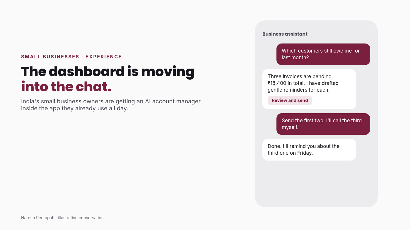
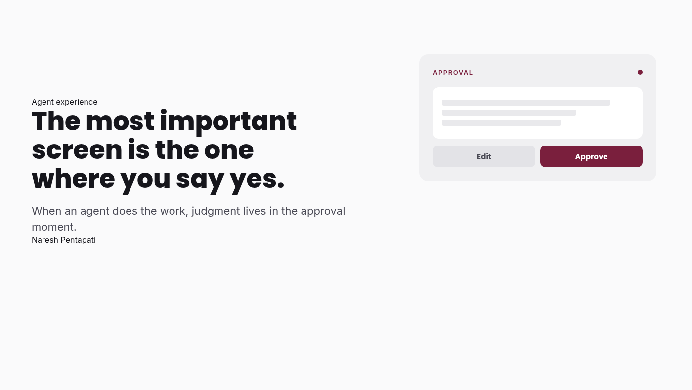
More and more of the work inside products is now done by an agent that searches, compares, fills in forms, drafts the reply, and lines up the action. The person shows up at the end, looks at what was prepared, and decides. In that world the screen that matters most is not the one where work happens. It is the one where someone says yes.
I think most teams are still designing that screen as an afterthought. A modal, a summary line, and a big blue Confirm button. That is a mistake, and it is going to cost a lot of trust.
The work moved, so the design has to move with it
When a human did every step, the interface was a series of small decisions. Each field, each dropdown, each next button gave the person a moment to notice something was off. Friction was annoying, but it was also how people stayed in control.
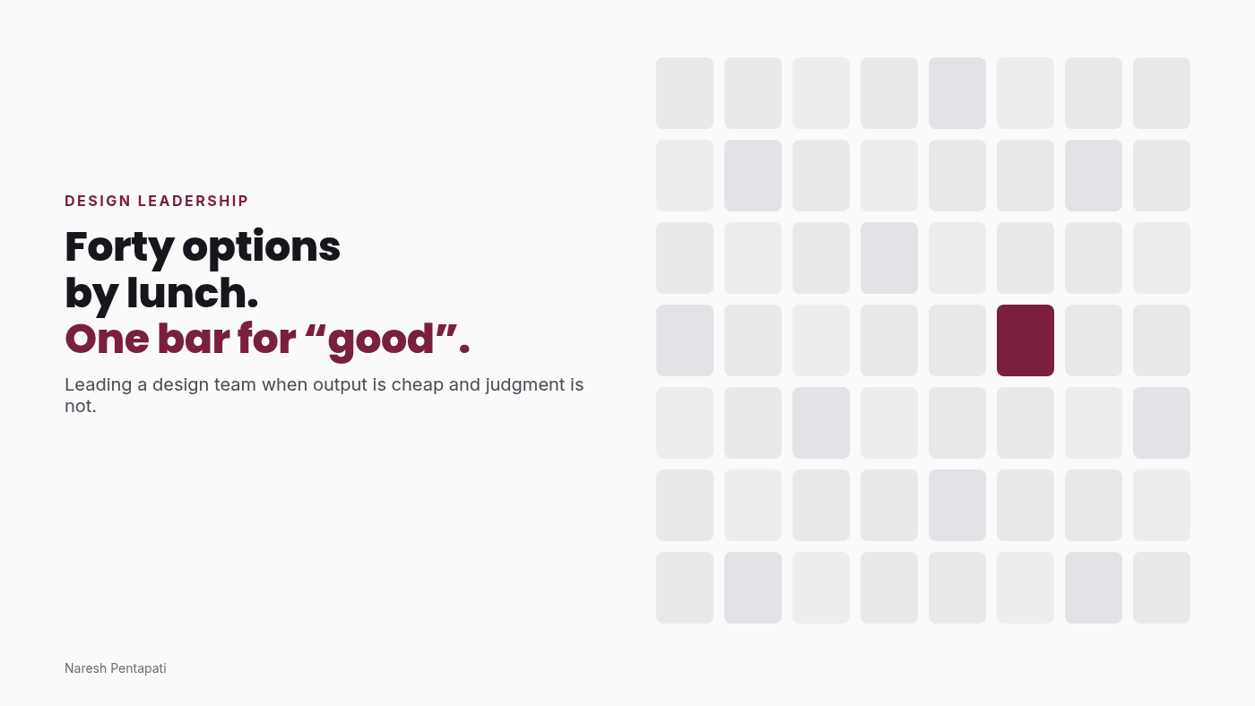
When an agent does those steps, all of those small checkpoints collapse into one big one. Twenty decisions get compressed into a single approval. If that approval screen only shows the final answer, the person is not really deciding anything. They are rubber-stamping.
I read a line in a recent ACM Interactions piece on systems that act for users that stuck with me: people need to know what is acting, why it is acting, and how to pause it before it spreads. That is a design brief, not an engineering footnote.
What a good approval screen actually shows
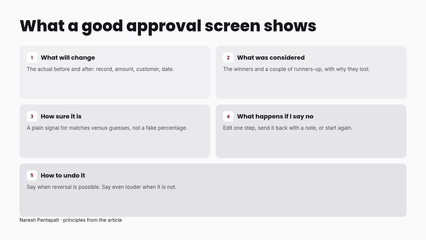
After years of designing enterprise flows where one wrong click could move money, change a policy, or trigger a government process, here is what I now look for when an agent hands work back to a person.
What will change. Not "Your request is ready." Show the actual before and after. Which record, which amount, which customer, which date. If you cannot show the change clearly, the agent should not be allowed to make it.
What was considered. If the agent compared fourteen options and picked one, show the two or three runners-up and why they lost. A confirmation that only shows the winner is not transparency. It is a done deal dressed up as a choice.
How sure it is. Not a fake percentage. A plain signal that says "this matched everything you asked for" or "I had to guess on the delivery address." People handle uncertainty well when you are honest about where it sits.
What happens if I say no. The reject path deserves as much design as the accept path. Can I edit one step and keep the rest? Can I send it back with a note? Or do I lose everything and start again? If saying no is painful, people will say yes when they should not.
How to undo it. Where the downstream system allows reversal, say so and make it obvious. Where it does not, say that even louder.
None of this is new to anyone who has designed for regulated industries. What is new is that every product now needs it, including the ones that used to be "just" a consumer app.
The design system becomes the guardrail
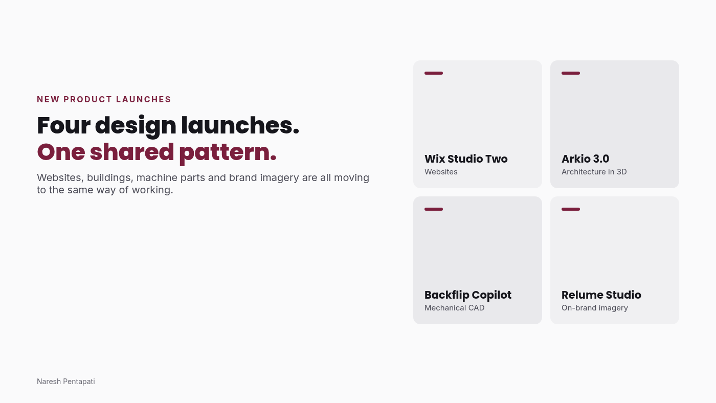
There is a second shift underneath this one. Agents are starting to assemble parts of the interface themselves, picking components and filling them with data based on what the person asked for. Google, CopilotKit and others are pushing open formats for this kind of generative UI, where the agent describes what to show and the app renders it from approved components.
That sounds like a threat to designers. I think it is the opposite.
If an agent is going to compose screens on the fly, the quality of those screens depends almost entirely on the components it is allowed to use and the rules around them. Which component to use when. One primary action per surface. Summary before detail. Approval behaviour fixed in code, so the model can propose an action but cannot change how consent works. A recent case study on moving from chat to an agent console found that the biggest gains came from design system work and component descriptions, not from prompt tweaks. That matches everything I have seen.
So the design system stops being a library for designers and becomes a contract between people and machines. The designers who understand that will have more influence over the product than they did when they owned every pixel.
What I would ask a product team to do this quarter
If you lead a product or design team, here are a few small moves that pay off fast.
First, list every place in your product where an agent or automation now completes work on someone's behalf. Most teams are surprised by how long that list already is.
Second, open the screen where a person approves that work and ask one question. Could a careful user spot a wrong answer here in under ten seconds? If not, that is your next design sprint.
Third, give the reject and edit paths a real owner. They are usually nobody's job.
Fourth, measure trust, not just speed. Track how often people override the agent, how often they undo, and how long they hesitate on approval. Those numbers tell you whether people are deciding or just clicking.
Less sparkle, more judgment
AI is getting very good at doing the work. It is still not very good at knowing when the work should not happen. That judgment stays with people, and the only place we give it to them is the moment they say yes.
So design that moment like it is the product. Increasingly, it is.
Naresh Pentapati writes about design, product, and how AI is changing the way we build. More at nareshpentapati.in.
Comments
Join the discussionNo comments yet. Be the first to comment.